Reading time: 6 minutes
The ideal landing page for lead generation
10 tips for conception and design
A good landing page is essential for lead generation. The design of the landing page and whether it meets the customer’s expectations significantly influence the Conversion Rate.
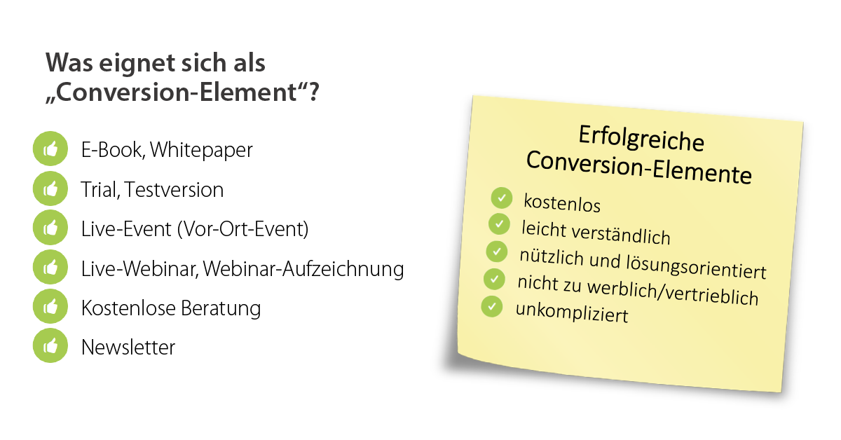
Landing pages can have different goals (lead generation, closed sales, remarketing, etc.) and map different content (lead magnets/conversion elements), such as event signups, whitepaper downloads, trials, contact requests, direct purchases, etc. We explain in this post how the ideal landing page should be conceptualized and designed for the purpose of lead generation.
1. focus on the benefit, not the product
A lead magnet (conversion element) – e.g. a webinar or whitepaper – is a valuable piece of content that is useful to the potential customer and can serve like a lure for lead generation. It is a credible promise!
When designing the landing page, the focus must be on the benefit of the lead magnet or conversion element, not on the benefit of your own product or brand! This would subconsciously create an advertising impression. The potential customer should think “Here I am offered useful information”, not “Here someone wants to sell me something”.
The landing page should therefore have a clear focus on promoting the lead magnet. You should put the problem and the solution in the foreground of the application and not the “tool”. Instead of writing, for example, “Download the demo version of our GDPR tool now!”, it is better to promote the tool only indirectly, e.g. like this: “We show in this free webinar how you can implement the GDPR in your company!”
In the lead magnet, too, the content mix should then be right between customer benefits and general information on the topic and product details. Once you have the lead, you can go deeper and deeper into the topic in the conversation – that’s then the job of sales. But in marketing, you shouldn’t scare off potential leads by communicating too product-heavy.
2. red thread for advertising material and landing page
Both the visual design and the textual content of the ad and landing page should be consistent, because: The user builds up a certain expectation when clicking on the ad, which should be continued in the landing page. Consistency is achieved, for example, by adopting text modules from the landing page into the ad or by using the same design elements (colors, graphics, etc.). A consistent text-image language and uniform key visuals increase the recognition value. This is also especially important because it takes up to 10 brand contacts or more to reach B2B decision makers.
3. less is more
Too much content in the form of text, graphics, etc. is generally not advisable when creating a landing page, so as not to overload or even distract the visitor. We all know how it is with attention spans in the age of social media. The goal to be achieved (e.g. event registration), including a clear call to action, should be the clear focus of the landing page; information around it is merely additional information and should be limited to the most necessary. Too much text increases bounce rate and decreases conversions; taking too much up front is also counterproductive.
4. clear structure
When placing the most important elements of a landing page, care should be taken to adhere to common website conventions:
- Logo on the top right or left; link to the company’s homepage
- Imprint in footer
- Navigation horizontally in the upper area OR vertically on the left side of the page
- Call-to-action in the form of a button
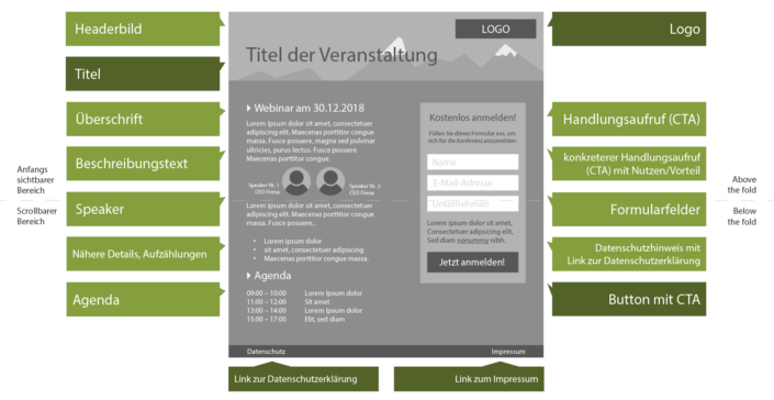
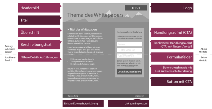
A clear structure of the website is important so that the user can orientate himself well. Increased usability helps reduce session abandonment. Our graphic shows how a Lead Gen landing page should ideally be structured:
The landing page of our customer abtis, one of the leading IT service providers in southern Germany, shown in part in the cover image of this article, serves as a practical example.
5. clear call to action
The call-to-action (CTA) must immediately catch the eye. Since the CTA contributes significantly to the success of a conversion, it is one of the most important components of a landing page. That’s why it should be placed as prominently as possible in the website’s viewing area and clearly communicate what the visitor should do next.
There are many ways to make the CTA effective. One of the most popular is a call-to-action button. This may well be larger than other elements on the landing page and should always be highlighted in color.
6. use contact forms correctly, do not ask for too much data
Basically, the same design rules apply to any contact forms as to the call-to-action: they should stand out from the rest of the landing page in terms of design and be placed as high up as possible (in the field of view!).
When designing contact forms, it is particularly important to request as little data from the customer as possible. Fields for Name, E-mail address and company are sufficient here. Once you have this data, you can easily query or research other data. If you ask for too much data, the user will often abort. With each additional field, the probability of an abort increases. Concerns about data privacy or simply a lack of patience are the most common reasons for abandonment here.
Plug-ins like LinkedIn AutoFill or social login plug-ins (e.g. Login with XING) can reduce the effort for the user, as data is pre-filled.
7. important elements must not be hidden
When designing the landing page, special care should be taken to ensure that all important elements are located in the visible area of the website, so that the visitor does not have to scroll or scrolls only a little. If this is not the case, it often has a negative impact on conversion.
To ensure that all elements are visible when called up, the landing page should be tested on different end devices. Responsiveness is the keyword here! This should be the case in any case, as the majority of users use social media platforms via mobile devices:
8. trust elements are conversion drivers
Customer trust is a critical success factor for a landing page. In the 2017 Edelman Trust Barometer, trust is cited as the most important reason for strengthening B2B customer relationships.
Brand awareness and trust often go hand in hand here. Because trust elements such as seals of approval, ratings, certifications, etc. increase this trust – especially for lesser-known brands – they are among the most important elements of a landing page. In B2B, it is also highly advisable to include logos of reference customers and collaborations with other companies. If, for example, you are a partner of a well-known large corporation, you can benefit from its brand awareness and should therefore definitely refer to this partnership (e.g. in the form of a partner logo) – because brand awareness increases user trust!
Graphically, in the B2B sector, the main thing to look for is a serious (rather than playful) design of the landing page. Advertising subjects that are too playful are counterproductive for building customer trust.
9. the shorter the loading time, the better
An important reason why you should not overload a landing page with elements is the loading time. Bells and whistles like plug-ins or too-large graphics make websites take much longer to fully load, and users abandon at worst. Therefore, the loading time should not exceed 3 seconds. With Google PageSpeed Insights you can easily determine the loading time of your landing page. Images and graphics can often be scaled down significantly without visible losses.
10. at the end you say thank you
Post-purchase dissonance refers to the state of uncertainty of the user/customer after the conversion has been performed. To reduce this uncertainty, the purchase decision is once again rationalized by the customer. This process can be positively influenced by a Thank-You-Page. A Thank-You-Page is ideally a separate page (with its own URL), to which the visitor only comes when a conversion has taken place, and on which the success (e.g. successful registration for the event) is confirmed and a thank-you is expressed.
Through a standalone Thank-You page, the measurement of conversion completion as well as retargeting of bouncers is possible through the placement of a pixel. For retargeting purposes, you can distinguish who visited the landing page but did not successfully sign up (= bouncer), and who visited both pages (landing page and thank-you page) (= lead). The bouncers can be retargeted in turn. – Don’t forget: 10 contact points!
